Click on any photo below to view gallery.
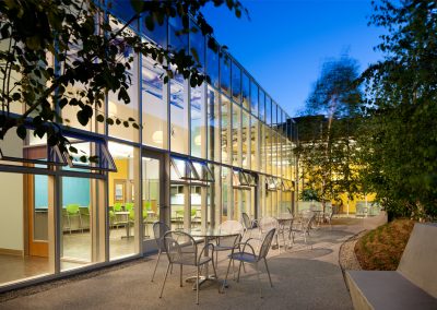
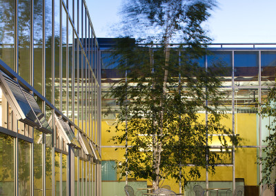
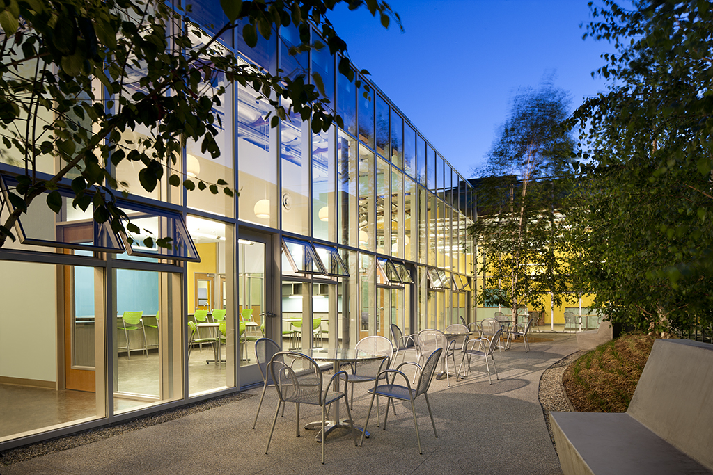
The glass walled courtyard was created by removing a section of roof from the center of the building. Shared amenities, including break rooms and meeting spaces were arrayed along he long walls of the rectangular space. The narrow ends open directly onto internal circulation aisles.
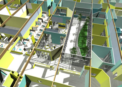
Overhead view of computer model showing the courtyard fit within the excising building structure, along with the surrounding meeting and break spaces
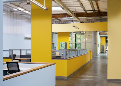
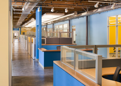
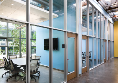
View along one of the internal “streets†that organize the interior of the building. The courtyard is visible through the glass walls of one of the break rooms. In the distance, the landscaped area to the north of the building is visible through new glass doors, nearly 200 feet away.
Polycarbonate panels finish the top portion of the full height walls. This allows for borrowed light between the spaces and reduces the apparent scale of the walls, to more human proportions.
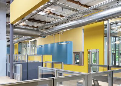
Exposed throughout the facility, all building utilizes were arranged to support the spatial organization established by the partition walls.
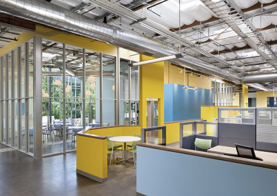
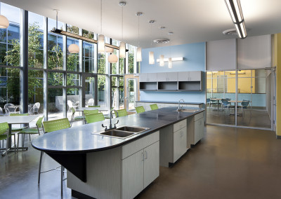
View from the southwest, through one of the break rooms to the courtyard beyond. Nearly ninety percent of all workstations have a view to an outside space.
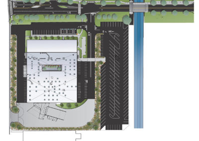
Project site plan illustrating the network of bio-swales through the parking area; the new access road to the north. West Edge Architects also designed the roadway and bridge crossing the flood control channel to the east.
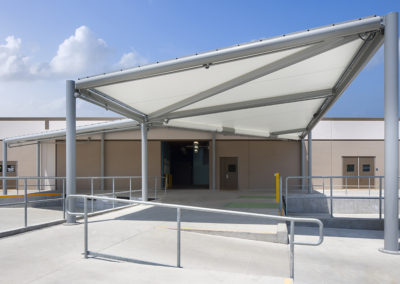
The fabric-roofed loading dock was installed after the facility was in operation. The entire assembly was put into place over the course of three nights, without interfering with operations.
West Edge Architects
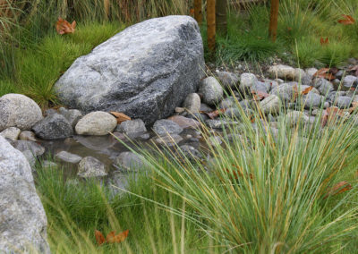
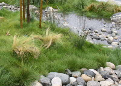
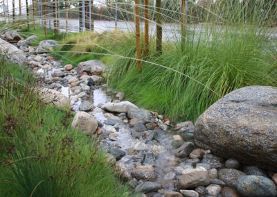
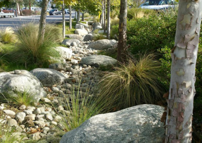
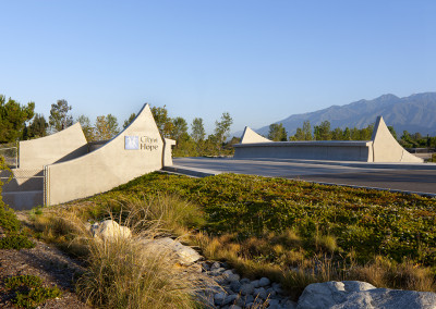
A new campus entrance road will provide access to the site from the north. A new entrance to the site at the southwest corner will facilitate truck access to the new loading docks on the south side of the building. Site parking and landscaping have been improved as part of the project to help meet sustainability goals. As an example, all surface storm water is being channeled into bioswales rather than into the municipal storm drain system. Other strategies include wrapping a planted screen over the south and east walls to shade the exterior of the building.
City of Hope FLASH Building
The City of Hope in Duarte, CA, along with West Edge Architects, Marina Del Rey, transformed a formerly dreary and windowless manufacturing building into a bright and welcoming workspace filled with skylights, glass walls, energetic colors, and an interior courtyard, viewable from almost anywhere in the building.
Glass-walled courtyard
The newly renovated City of Hope FLASH (Facilities Logistics and Support Hub) Building is a conversion of a 55,000 SF tilt up concrete industrial building, constructed in the 1970s, into a synergistic modern environment for the facilities and operations functions, formerly housed throughout the 124-acre campus. The project uses green building attributes including skylights, natural ventilation, a vertical planting screen that shades the building, 100% storm water capture on site, and repurposed office furniture and is pending LEED Silver. It is intended to serve as a demonstration project and training environment for the institution’s sustainability goals.
FLASH brings together a wide range of functions, from offices to machine shops. The organizing element is a glass walled courtyard carved out of the building center, which fits well within the park-like setting of the City of Hope campus. The tree-filled space serves as the heart of the building, and given the building’s large footprint, the courtyard makes the space more habitable for its 160 occupants, as almost everyone gets a view to the outdoors. Operable windows and doors in the courtyard’s enclosing glass walls provide natural ventilation during times of the day and times of the year it is advantageous. All inhabited spaces have natural day lighting through sky lights.
Sharing common support spaces provides a sense of community and increases efficiency for the employees, who previously had worked in a variety of environments (often make-shift) throughout the campus. The interior layout of the building has the feel of a village plan, with primary circulation pathways organized like a pedestrian scale street grid. Informal meeting spaces occur in widened areas or alcoves at intersections and terminal points. The two primary north/south streets share the courtyard’s glass enclosing walls on the east and west sides. All departments are accessed from these streets through archways that spring from low partition walls that define the street edge. This strategy simultaneously allows each work group to maintain their identity yet share a community with associated departments.
Departments include Engineering Services, Occupational Health and Safety, Security, Research Storage and Purchasing, Printing, Mail Services and Biomedical Instrument Services. Activities include open and private office work spaces, an emergency operations center for the campus, a carpentry shop, repair shops for instruments and equipment, locker rooms, shipping and receiving. Exterior components include covered truck docks, landscaped bioswales for the collection of storm water and charging stations for a large fleet of electric carts.
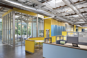
The building’s wood framed roof is left exposed throughout the majority of the building. Exposed utility elements, such as piping, air conditioning ducts and pendant lighting have been carefully configured and composed to reinforce spatial relationships and when possible perform double duty. For example, lights are positioned in relation to HVAC ducts so that the ducts reflect and distribute light. HVAC ducting that runs parallel to main circulations pathways has been positioned over the low walls that define the edges of the workspaces along the walkways. This keeps the implied ceiling taller in both the circulation and work spaces, so that you feel the full height of the space.
City of Hope Interior Space
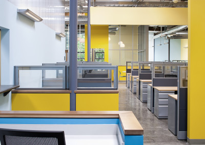
The interior space is large and open, but not undifferentiated. All the elements of the building, including exposed utilities, are used to organize the space. The height of the space is felt, but the composition of elements within the space is at a human scale. It is an exciting and comfortable space to be in. Full height partitions measure over 16 feet tall but are seldom uniform for their full height. Partitions that define the northern and southern limits of the primary open space are finished in painted gypsum board up to eight feet above the floor. Above that, the full height metal studs are clad in translucent polycarbonate panels on both sides. This strategy provides scale to the partitions, helps the observer comprehend the larger spatial organization, and allows light from skylights to permeate adjacent spaces. In other locations where the need to separate conditioned and non-conditioned spaces was not present, the upper portions of walls were left as framed openings above eight feet.
The color strategy was devised to achieve a number of objectives. The primary color palette consists of five shades of blue and five shades of yellow that are chromatically complementary, or opposite across the spectrum. The specific option of colors was chosen to work with systems furniture that was purchased for re-use from another organization. These colors also work well with the colors present in the landscape, visible in the courtyard and through large portals on all sides of the building. As a means of ensuring that no room would be a single color, the yellows were assigned to the north south walls and the blues were assigned to the east west walls. The varying shades of each set of colors were organized lightest to darkest. Light colors were placed on walls that contained exterior glass to minimize the contrast between the brightness of the sky and the adjacent wall surfaces. Shades of color on parallel walls then progress sequentially, light to dark. Walls in the same space are typically two different shades in the progression. Perpendicular walls are chromatically complementary, creating a pleasing balance in each space. This system is modified to some extent in that colors don’t typically change on the outside of 90 degree corners and walls are painted the same color on both sides. This allows the full thickness of the partitions to be felt, which helps stabilize an otherwise very dynamic visual environment.
Office areas are concentrated in the two-story, north end of the building and around the 74 x 24 courtyard. Interior glass storefront walls enclose shared conference and lunch/break rooms which abut the courtyard on two sides and permit views through and from office areas beyond those spaces. Interior windows permit views from shop spaces to the courtyard.
CLICK ON ANY PHOTO TO VIEW GALLERY
The glass walled courtyard was created by removing a section of roof from the center of the building. Shared amenities, including break rooms and meeting spaces were arrayed along he long walls of the rectangular space. The narrow ends open directly onto internal circulation aisles.
Overhead view of computer model showing the courtyard fit within the excising building structure, along with the surrounding meeting and break spaces
View along one of the internal “streets†that organize the interior of the building. The courtyard is visible through the glass walls of one of the break rooms. In the distance, the landscaped area to the north of the building is visible through new glass doors, nearly 200 feet away.
Polycarbonate panels finish the top portion of the full height walls. This allows for borrowed light between the spaces and reduces the apparent scale of the walls, to more human proportions.
Exposed throughout the facility, all building utilizes were arranged to support the spatial organization established by the partition walls.
View from the southwest, through one of the break rooms to the courtyard beyond. Nearly ninety percent of all workstations have a view to an outside space.
Project site plan illustrating the network of bio-swales through the parking area; the new access road to the north. West Edge Architects also designed the roadway and bridge crossing the flood control channel to the east.
The fabric-roofed loading dock was installed after the facility was in operation. The entire assembly was put into place over the course of three nights, without interfering with operations.
West Edge Architects

