Click any photo below to view gallery.
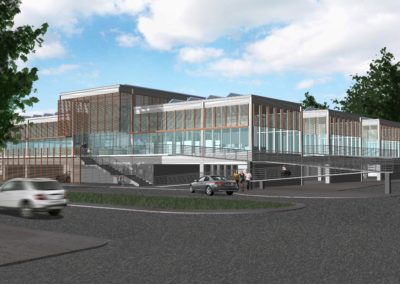
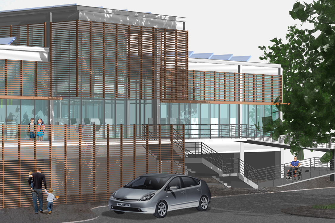
View from the parking lot, across the entrance drive to the entrance face of the building. The library’s volumetric organization is clear in this view: the taller, central volume connects to all programmatic components, which are separated by three-sided courtyards located on both flanks of the central space. Not accidentally, the dimensions of the courtyards and the building elements they alternate with align with the parking layout below (three parking spaces, two parking spaces, three parking spaces, etc.)
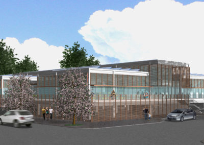
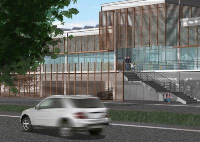
The building is surrounded by a wood lattice to reduce heat gain and diffuse the day light entering the interior spaces. The roofs are covered with solar panels that act to shade the roof as well as generate power for the building.
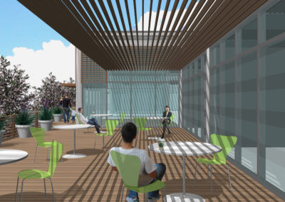
The courtyards are shaded by trellises over nearly half their area. This also helps to cool the layer of air surrounding the entire building. The second level condition allowed the librarians to be comfortable with books out in the courtyard spaces, something they would not have considered for ground level outdoor spaces.
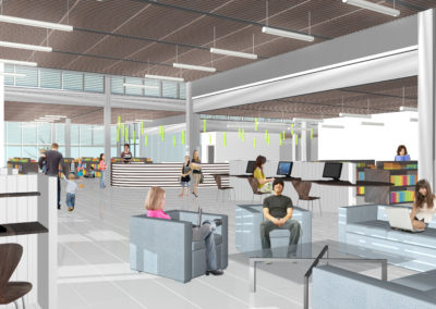
Interior view of the central space of the Library, the circulation desk is visible in the background. Movable furniture allows for multiple uses within this area, permitting flexible programming and change of uses over time. The height differential between this space and the surrounded volumes made places for operable clerestory windows. The crenelated footprint of the building would allow for an abundance of daylighting and views to the outdoors from any part of the building.
City of Glendale Parking Lot Branch Library
After completing a Needs Assessment and Facilities Assessment (with Civic Technologies of Pasadena) several years earlier, West Edge Architects was asked to determine if the requirements of the Needs Assessment could be met. Specific considerations included location with respect to service population, and whether the construction of new branch libraries could be limited to property already owned by the City of Glendale. The idea was to reduce the threshold cost of a new facility by removing the land cost form the calculation.
The properties the city already owned fell into three categories: property on which the city already had a building of one function or another, all of which were in current use; parking lots; and parks. These last two presented challenges. Parking lots were seen as essential to the related civic functions they served. Park space was already in short supply, so the replacement of open space with a building would not be well received. The two prototype studies that West Edge Architects completed assumed that in the case of the parking lot sites, no parking spaces would be lost and in the case of the park sites, the character and extent of the park would be preserved.
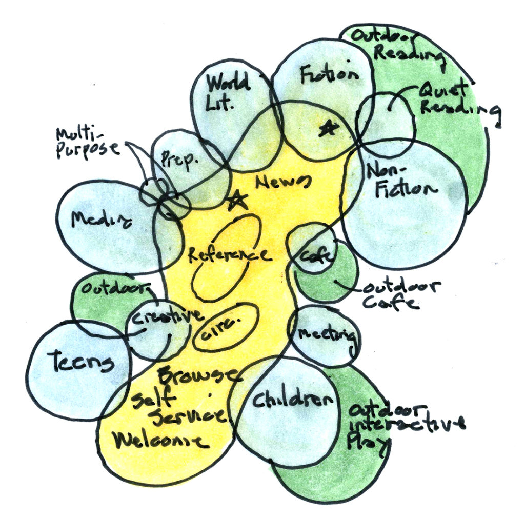
Prototypes for both locations, park and parking lot, were based on this diagram, which organized specific program spaces around a more flexible central spaces that would allow for adjustments in programmed activities over time.
Project Description:
The library’s interior spaces are organized around a center volume with welcome displays, circulation and other patron services; exhibitions and interactive activities; and seating and staff areas. All resources are visible from this space. A teen center, children’s library, meeting and training spaces, and a café are housed in separate volumes that intersect the center space. Outdoor courts that extend the library’s interior to the exterior are connected by terraces, permitting activities to be visible to the public on the building’s street side. A variety of roof heights permits an extensive use of clerestory windows that provide indirect, natural light throughout the building.

