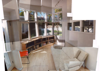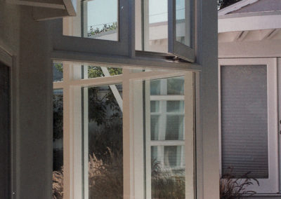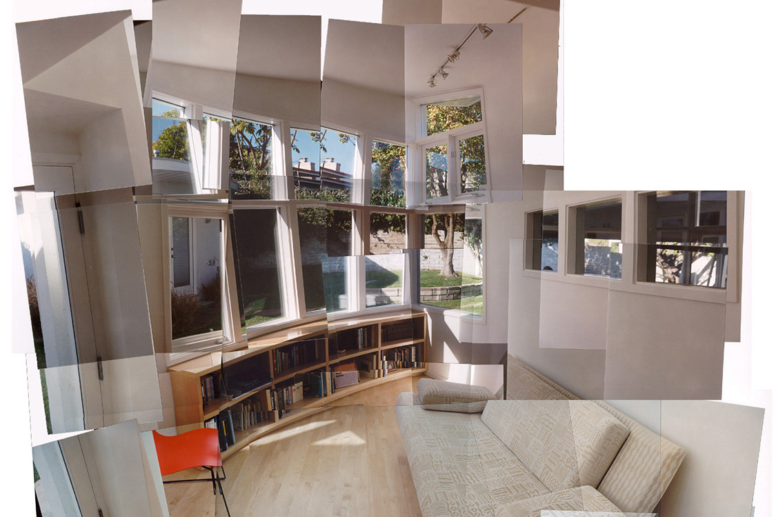
The family room is the only ground-floor space that utilizes the curved geometry, a strategy that unifies the overall composition. It also allowed the room to have the required area and not violate required setbacks from the adjacent studio building (visible through the windows to the right).
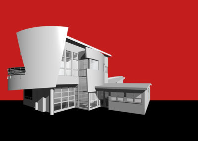
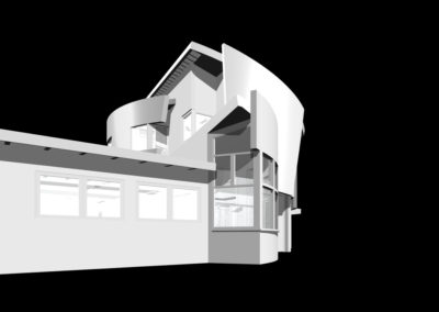
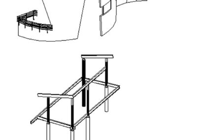
View of the computer model from the street side, above the patio. The master bedroom suite is located over the entire west wing of the original house. The stair space, which is constructed outside the original first floor footprint, is partially captured by the curved wall that encloses the study/office space that projects from the main volume of the second floor addition.
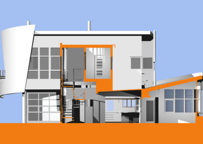
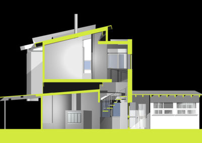
East/west section through the computer model. The new second floor is supported independently at an elevation that allowed the existing living room roof to remain in place (stripped of its waterproof membrane). This created an interstitial space to run utilities and would also act as a sound barrier between the spaces.
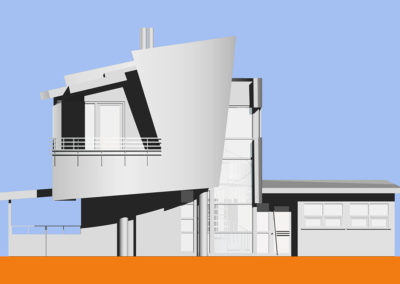
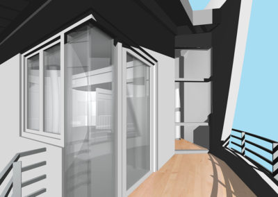
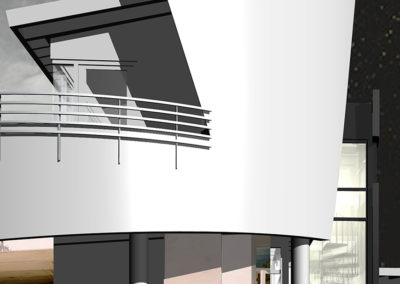
Flattened view of the computer model from the south. The curved wall that extends to create the balcony wall of the master bedroom is prominently featured, as is the wood-framed glass wall that encloses the two story stair space.
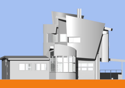
Flattened view of the computer model from the north (rear yard). The shape of the family room projects out from the main masses of the first level. The curved north wall of the master bath is visible above. The slot window provides a view to Century City for someone sitting in the bathtub.
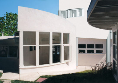
View of family room prow, looking toward the studio building. The prow affords a 180-degree view of the backyard and is a popular place for the cat to spend the afternoon napping.
Wing and Wing Modifications and Additions
With partial ocean and mountain views, this addition features a new bedroom, bath, closet and study on a new second level and a family room on the existing first story. The view of sailboats inspired the wing and wing design.
The configuration of walls and fenestration of the existing one-story house did not provide an opportunity to support the second-floor addition without extreme compromise. The design solution employed a steel moment frame built outside of the original structure that supports both the vertical and lateral loads of the new upper floor. This system also provides a framework for floating enclosure walls on the second-level that were shaped by criteria other than structural requirements, and therefore did not have to be orthogonal, straight, or plumb.
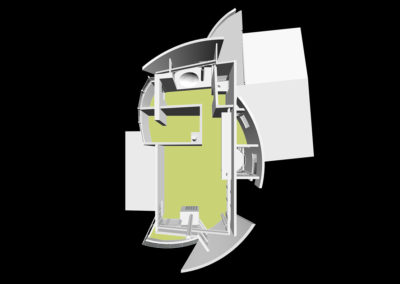
Computer model of the project. The original house plan is approximately an octagonal Z-shape, with the front bar of the Z set at a slightly skewed angle, to parallel the property configuration. This bar housed the living room, the east-facing wall of which was largely a carpenter-built wood window system from floor to ceiling. The 4×6 roof structure was exposed throughout, under the low-pitched roofs.
The idea was to create a compositional contrast to the geometry of the first floor, and to carefully edit views to the surrounding landscape and distant views to the ocean and mountains. Some proximate features were best left obscured, so prominent portions of the second floor enclosure walls were curved into sail-like shapes. This geometry was inspired by the boats moving in an out of the nearby marina and represented an appropriate metaphor for life in modern times, at least to the architect.

